are you making these website mistakes?
Your website should be your best unpaid salesman, making sales 24/7, and helping you build your brand. But, how do you know if your website is actually responsible for keeping clients away? Are you making these common website mistakes? Read on to find out.
A few years ago I had a really bad website. More than bad, it was ultimately outdated and not driving a lot of clients to my business. You see, when I began designing websites, all that I cared about is that they looked nice and cute. My main focus was on design, not really anything else. Back then, I didn’t understand the power that a truly great website can have over your business. I was making a huge website mistake! Today, I really really get just how important it is to have a pretty great page. A great website will be able to connect with your audience, capture their attention and convert them into buyers.
 I covered some of these themes recently in what you need to know about having a website that converts. This time, however, I want you to take a look at your site to determine what’s not working for you. So, how do you know if your website needs to change, ASAP? Here I give you 5 signs it’s time to redesign.
I also created this free guide which covers other REALLY common branding + website mistakes you want to AVOID if you are looking to attract the right clients into your business.

there´s no branding
So, this is pretty obvious, right? I mean, in order to build a brand that truly connects, there actually has to be a brand in place. Your logo has to be seen front and center (or to the left corner), your colors have to be consistent as well as your fonts.
The reason for this is that branding is basically the one thing that will make you stand out the most. A well-designed website will build your credibility while making you look great in the process.
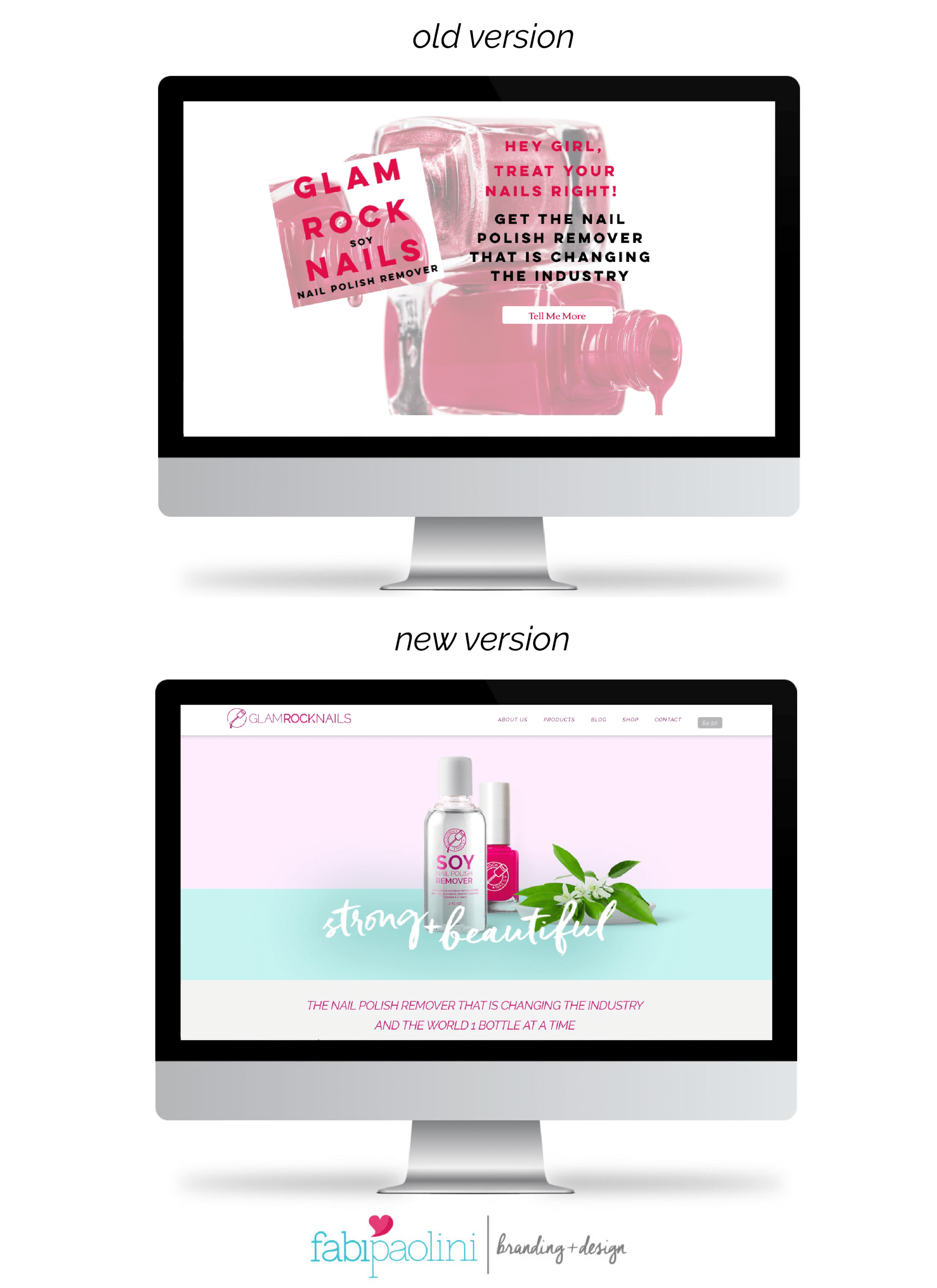
Take Glam Rock Nails for example, their old website really didn’t have any branding at all. Actually, the logo that they used to have wasn’t really a logo at all. When they came to me, it was important that we make a change to reflect what the brand was really about. Can you see, just from looking at the visuals how much more credibility the new website design has versus the old one? You can tell, from looking at their old website that they were making a mistake by not having a brand that really stood out.
The reason for this is that in order to build a brand, it’s important to make sure that it looks pretty great too. If your website looks bad, has terrible navigation and is simply confusing, you can bet that it’s putting people off. If it’s hard for you to understand where things go in your page or have to click a bunch of times in order to get to a specific section, it’s going to be even harder for your clients to know where they need to go.
Did you know it takes people 3 seconds to make a decision about who your are and what your business is about? 3 seconds?! That’s nothing! So, if people come to your page and are really lost, and don’t see a clear brand, you basically are losing credibility — quickly.
Remember to download the free branding + website mistakes guide so that you can quickly fix these common mistakes!
not mobile friendly
Okay, this is actually a biggie. I wonder how many of you are reading this article from your cellphone? Actually, I do know. The great majority of you. So, imagine how many readers I would lose if my webpage wasn’t mobile friendly. Everything today happens on our phones. We’re reading while we wait for something, reading while we eat, reading when we take a break, checking out our phones constantly so we don’t miss a beat! So, not having a website that is truly optimized for a cell phone is really putting people off! In my experience that’s how it has been. I mean, when I get to a website that is really hard to read, I have to zoom in, or it still has Flash, I leave immediately. It’s annoying and doesn’t capture my attention at all.
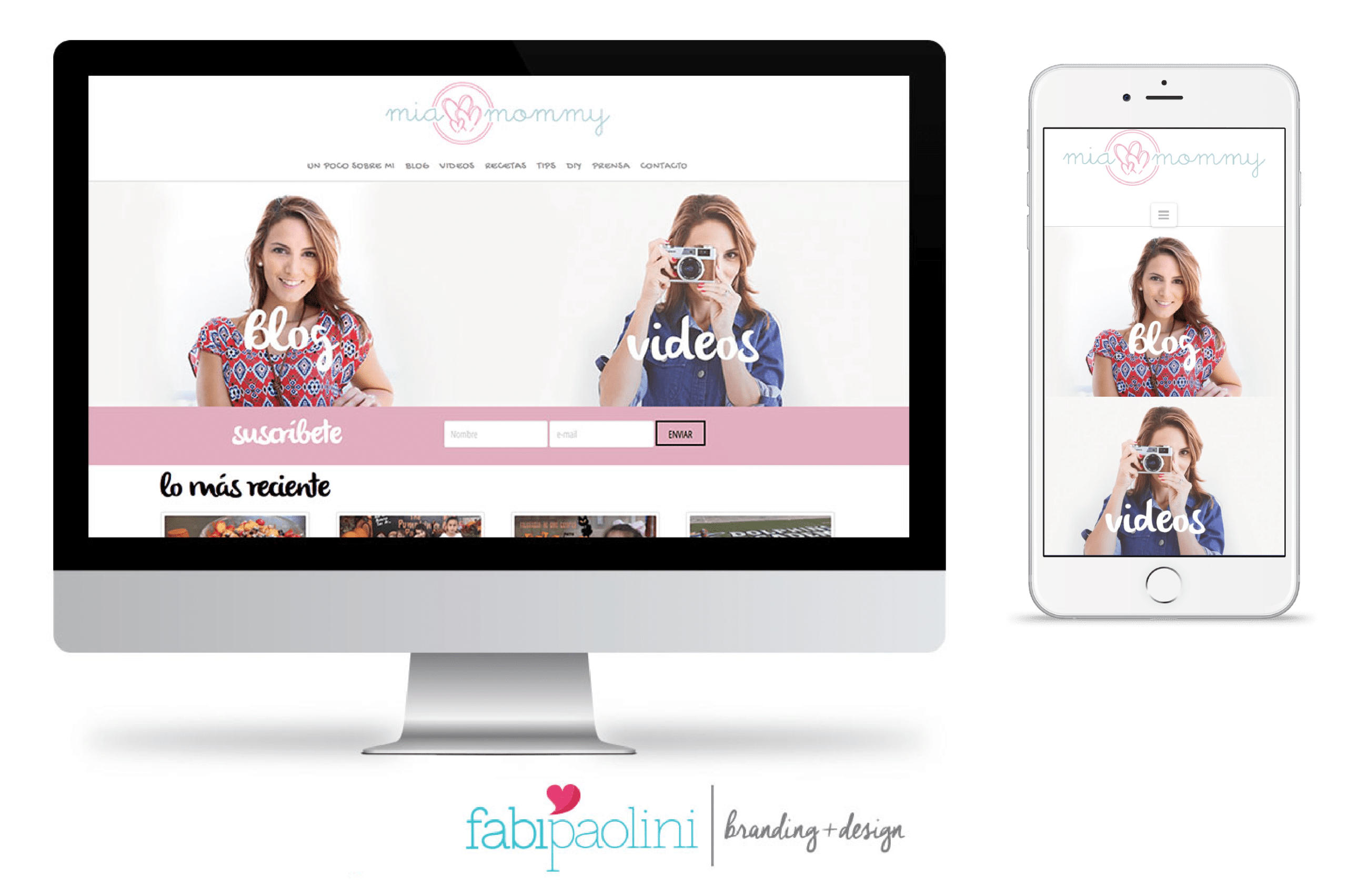
You really want to make sure that your site is as mobile friendly as possible! Not doing this is a huge mistake! This is particularly important when you’re thinking about the behaviors of your audience. For example, Mia Mommy is a blog directed at moms. If you’re a mom, you know that you hardly ever have time to sit at a computer to check out a website. You read while you’re putting your child to bed or while you’re at the park with them. So, having a mobile friendly website is particularly important to MiaMommy’s audience.
really outdated
In general, a webpage has to be updated at least every 3years in order for it to have relevant information. So, that means that if your webpage hasn’t been updated recently, it certainly is putting clients off. I mean, imagine going to a website that says something like “Happy New Year 2010, here’s what’s new with our business this year” What the what? Can you imagine?
Of course, that might be an extreme example, but businesses evolve constantly, and you need your website to reflect where you are right now and how you are helping your clients solve their problems. I have talked about this before, in business everything comes down to problems and solutions. That means, what people are struggling with and how you can help them solve them. So, in the past 3 years at least, it’s likely that you have earned new skills or gained more experience that is helping you solve problems even better. Your website needs to reflect precisely that. What you’re able to do for others.
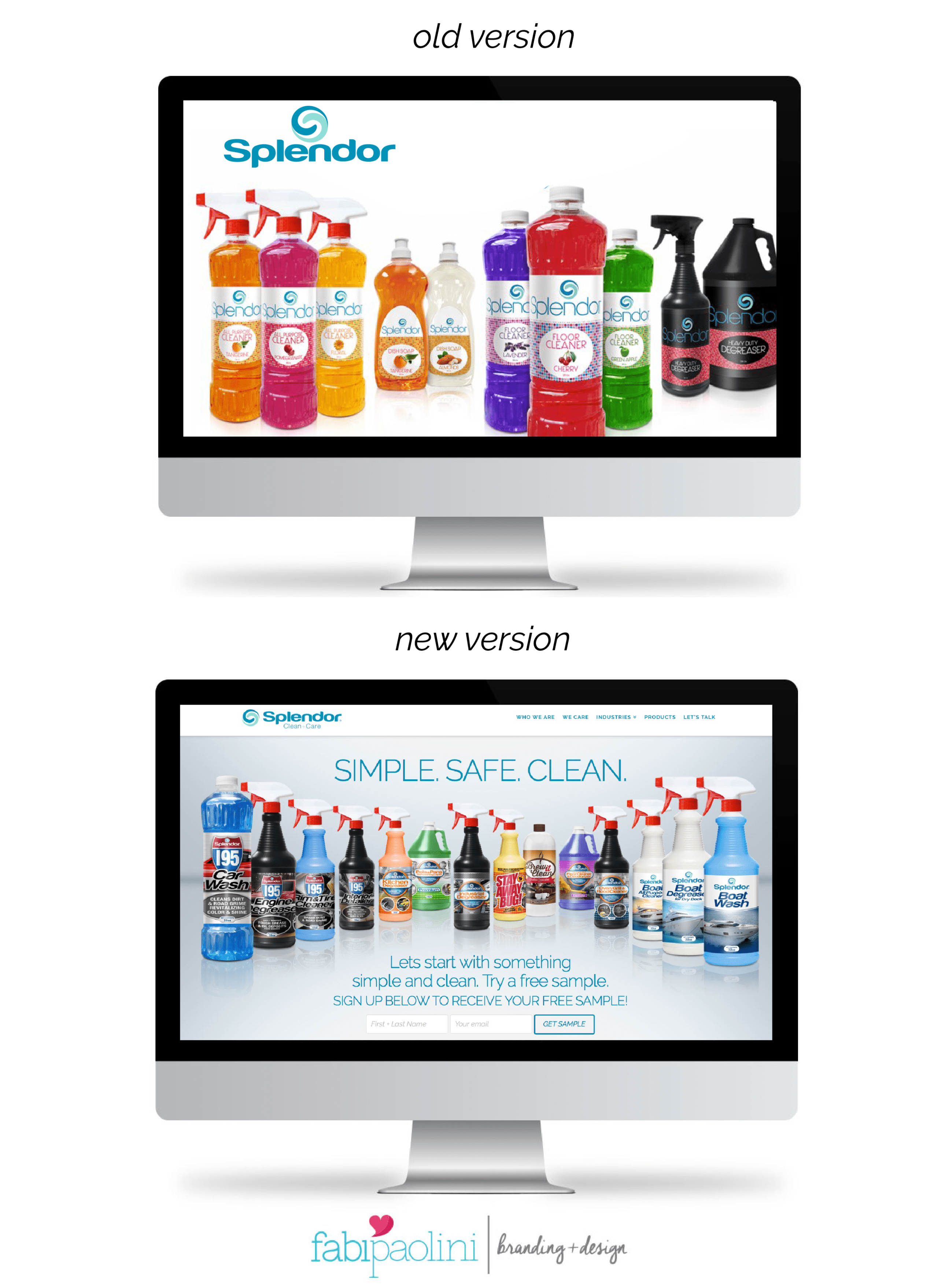
Take Splendor Clean + Care, for example. They had a pretty old and outdated website. This is a pretty big company that sells cleaning products and recently started distributing in a new market and country. However, their webpage had images and text related to their old packaging. That means that if clients were to hear about them and then research them online, they wouldn’t find the photos of their products on their webpage. Can you imagine how much that was hurting their business? So we changed their webpage to really reflect what they sell and also, their positioning (more on that next).
lack of positioning
I have actually talked about this before, when I mentioned the most important shift I did in my own business. One of the big mistakes that I used to make in business — and in my website, is that it was all about what I do (or rather, did). So, you would go into my website and it would be all ” I’m a designer. I design logos. I create websites.”…me, me, me, me, me. It was all about me. No positioning whatsoever. What happens with that, is that you’re obviously and quite literally not thinking about your audience. So, your kind of being aggressive and not very tactful in the way you are selling. When you shift your communication to your audience and their problems, it actually makes it easier to reach them and make a sale. More importantly, it helps build connections. So, in my case that meant changing my positioning from talking about what I do, to addressing what I actually do. Now I say “I help entrepreneurs create unique brands that attract.” See the distinction? Being really clear about this is really important for your brand. It’s never about what you do, it’s really about what you are capable of doing for others. This is the best way to truly connect with your audience, to get what their problems are and to find solutions tailored specifically for them.
So, if your website is ALL about you and isn’t considering your audience at all, then you’re absolutely keeping clients away. That means that your conversions are probably pretty low. The way to fix that is actually getting pretty clear on your brand and knowing precisely what your positioning should be and what your Unique Selling Proposition is. It’s also fundamental that you really get who your audience is.
lack of interesting content
We have made it to the end and -hopefully- you didn’t find any of these problems in your webpage! Here’s the final and probably the most important thing that could potentially be hurting your business: lacking interesting content. Creating valuable content and sharing it does something truly essential for your business: it builds trust. Trust marketing is the latest trend that is growing in population, and there’s a big reason for that. When you build trust in your audience, you are able to connect with them more and sell without any effort.
The truth is, it shouldn’t be about selling, it should be about creating something so great, it simply makes sense for people to work with you. When you deliver great content, you are basically paving the way for people to fall in love with your brand.
Now, remember, that the ultimate purpose of your website is to build your brand, connect with your audience, capture their attention and convert them into buyers. In order to do all that, the content you are sharing on your page has to be interesting. It has to add value. It has to have a clear purpose and direction. So, everything you create must have an intention beyond creating for creating. You have to create and share what will help your audience the most. How do you know what sort of content you need to be creating? Well, you start by listening to what people are saying. Dive into understanding their needs and what they are engaging with you most. Take a look at old blog posts and see which ones are your most popular ones up to date. That will give you insight into the type of content that is working best for you.
For every piece of content you create, ask yourself these questions:
What is my goal with this?
What is my audience learning from it?
What is the outcome people will have from reading it?
What action do you want your audience to take?
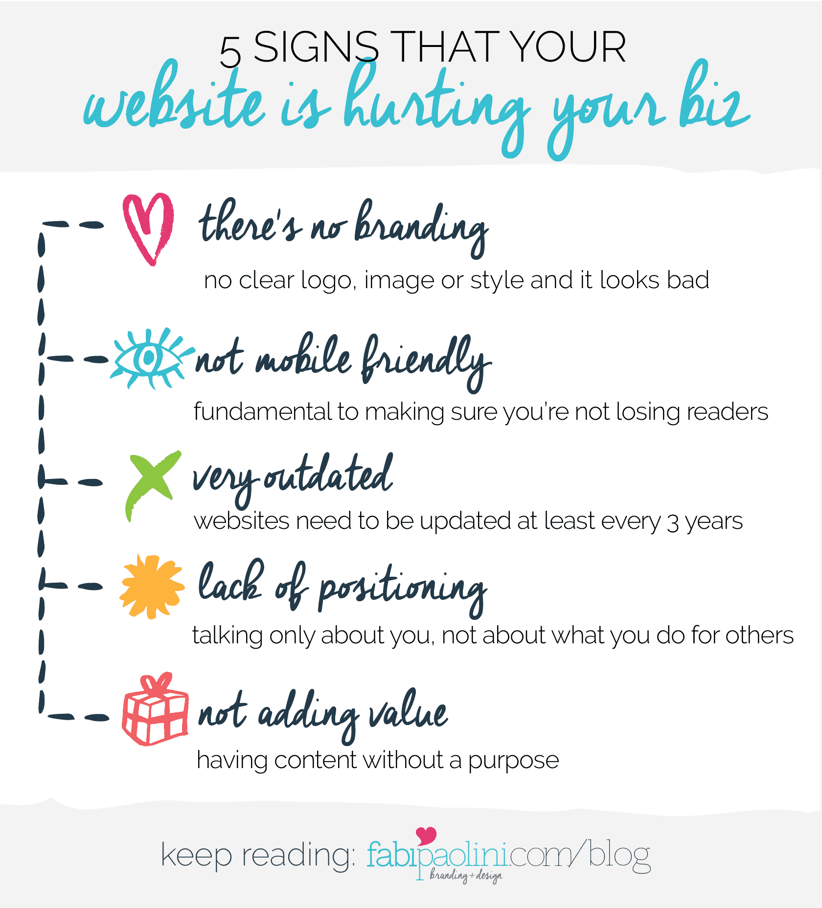
All in all, having a website that is not attracting people is ultimately hurting your business and, more than that, making you miss a ton of opportunities to grow. This is the big mistake that you want to avoid. Branding is a big part of solving it, for sure. Because making sure you look great, are defined in your positioning, and know your audience, will enable you to create that great content that ultimately will help you grow your business.
Remember to download the free guide with the 5 most common branding and website mistakes keeping you from attracting the right clients!
