do you know what it takes to have a website that builds your brand and converts?
If your website is there only to “look cute” and is doing nothing really for your brand, you have it all wrong. Heck, you might as well not even have a website at all. So, what does it take to have a great website? Read on to find out.
 I’ve been building and designing websites for all kinds of brands for the past 10 years. I started with what used to be super cool, which was sites full of Flash animations and huge, heavy graphics. Over the years, I have learned so many things about making great websites. You know, ones that actually sell!
The thing is, that a website is fundamental to your business. Specially today. Why? Because more and more people are online each minute that goes by. In fact, it’s estimated that by 2020, virtually everyone in the world will be online. That’s more than 7 billion people. So, if you’re not online showing what you do, who you serve and what makes you unique, that’s a whole lot of missed opportunities for your business. With more than 7 billion people online, there’s a lot of potential clients. A lot.
I mean think about it, anytime you need anything really, you go online to search for it. Whether it’s a product or a service, you really need to be available so that people can find out who you are and how you can serve them.
Not only that, but it takes people 3 seconds on your website to make a decision and form a perception about who you are. Three seconds?! That’s insane. So, obviously, having a website done in the right way could literally make or break your business.
Now, I do want to admit that my website used to be pretty basic. I have learned over the years different strategies to make changes and be more effective. Clearly, if you’re reading this, it’s probably working correctly, right?
If your think that your website is just about looking pretty and having no strategy or thought behind it at all, you’re wrong. According to Marie Forleo, your site is actually meant to:
Build your brand
Connect with your audience
Capture people
Convert readers into buyers
I also created this guide for you with the most common branding and website mistakes you might be making that are keeping you from bringing in the RIGHT audience to your business. You can download it right here:

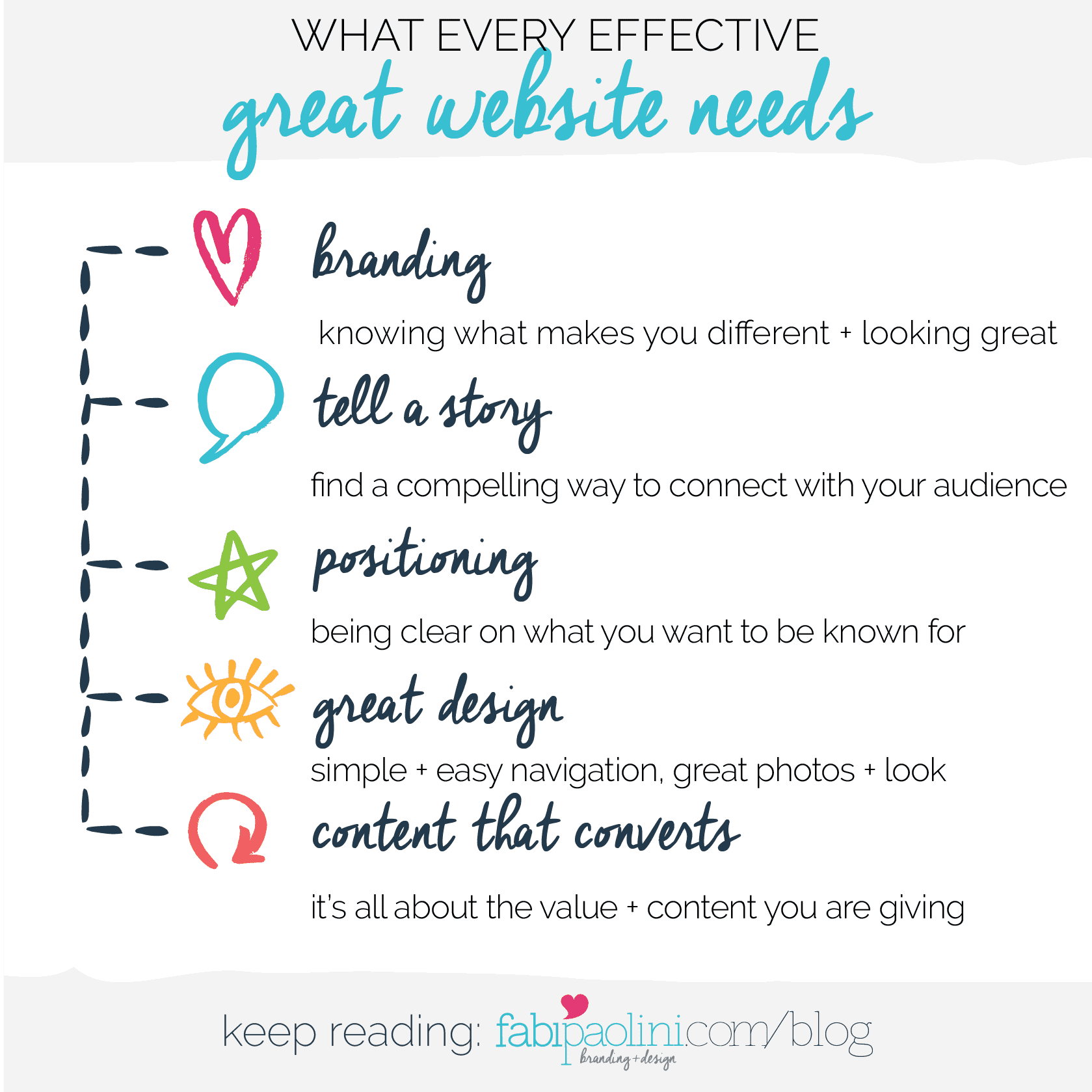
it all starts with branding
Having a great website that converts and builds your credibility has to have the most basic component of all which is a well defined brand. Every brand has 3 basic pillars that you need to work on in order to move forward.
First is The Brand Foundation. This is about defining who you are, what makes you unique and how you will differentiate yourself from everyone else. It’s also about getting crystal clear on who you audience specifically is.
Second is The Brand Identity. This is all about making sure that your brand looks incredible. A great logo, a defined color scheme, capturing images and consistent fonts.
Finally, The Brand Experience is about building an experience for your audience. All of these elements are necessary in order to have a great website that connects, that captures and converts.
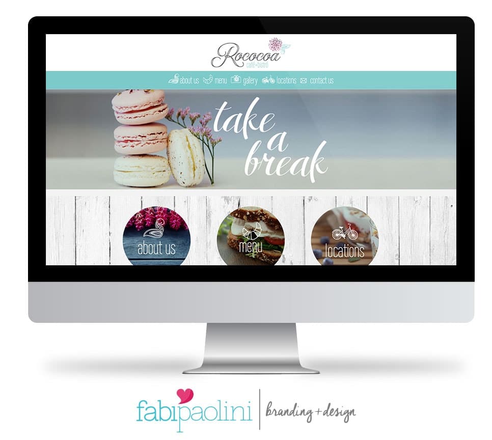
So, for example, Rococoa is a café + bistro in Florida for which I designed their branding and website. Their brand is super fresh, light and elegant at the same time. They wanted to invoke this feeling of a modern Parisian pastry where you can go to relax and get carried away in your imagination. Their website uses the colors, fonts and style of their brand.
tell a story
The main function or purpose of your website is to connect and build a relationship with your audience. Yes, you want it to sell, but before selling, you need to make sure you’re connecting. So, your website needs to be able to tell a story about who you are, what makes you unique and why people need to trust you.
One of the things that I find more important is really making sure that your personality is capable of shining through your website. So, a very corporate and cold page probably won’t be as effective as copy that really engages the reader. Remember, in the end it’s all about connection. And we connect when we feel that people get us. Like really get us.
So, you want to make sure that people get that behind your website or business, there are actual human beings that exist and have lives just like your audience. You want to use colors, photos and text that’s there to serve you.
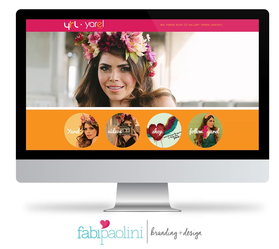
For example, I have been lucky to work with my friend Yarel Ramos for a few years. She’s a Mexican-American TV Host that is super successful and has worked for years in Telemundo, the biggest Hispanic channel in the US. Anyways, Yarel’s brand is all about her Mexican roots. So, the story she tells through her site is that of who she is, and how she gets Latinos in the US. The story she tells through her website is seen through the colors and photographs that immediately take you to her culture.
it´s all about positioning
In order to really capture the attention of your audience, you have to be very clear on the way you position yourself. What does that mean? Well, basically it’s about how you want to be seen or what you want to be known for. In business (maybe in life too), everything comes down to problems and solutions. So, that means that what you have to do really is convince people that go to your website that you’re capable of solving the problem that they have. And that problem may be super complex or super simple like, they’re bored and are looking to be entertained. Nonetheless, it all comes down to how you are communicating what you do. So, if talked about this before. I used to say that I was a designer that did logos and websites. My website was all about my skills, what I do, the process, what I have studied and the experience that I have. Believe it or not, that doesn’t sell. So, once I changed my communication, and my positioning to say that what I do is create unique brands that attract. Well, that made a huge shift in my business. Now, I’m talking about problems and solutions. What do you need? You need a business that attracts people. What do I do? Build you a brand that does just that. Make sense?
So, what you communicate on your website has to be geared toward your audience. When you share your skills or your experience or your credentials, do so in a way that really relates to your audience.
Sandra, for example, is an image coach + consultant whose positioning is based around the fact that she’s helping you create the best version of yourself. She could have said that she’s a stylist and will help you choose your clothes. However, that’s not the best way to position yourself when you want to capture people’s attention. Changing the copy to reflect something beyond the literal thing that she does really help in building her brand and makes her website more effective.
I cover positioning in detail in the guide I created for you with the most common branding + website mistakes and the tweaks you can do to really change your conversions. Make sure to download it right here:
great design
Of course, you really need to make sure that your website actually looks great. This in theory should be obvious, but there are a ton of really, really bad websites out there. A website needs to be pleasing to the eye, with colors and fonts that make your time on the page pleasant and longer! You want your readers/followers/audience to stay on as long as you can. You want to capture their attention, right?
Beyond the colors and fonts and layout, there are a few key things you need to take into account.
simple navigation
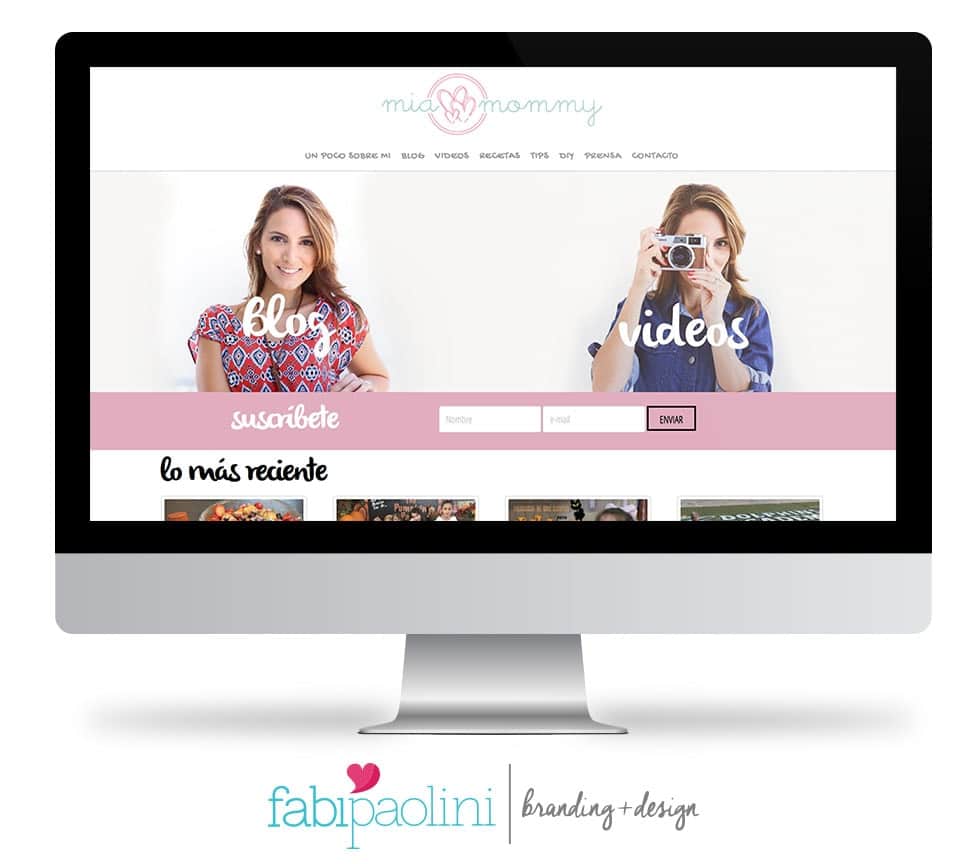
Your site needs to be super user-friendly. Keep your navigation as simple as you can. You want to make it easy and fast for people to find what they are looking for within your site. So, if you have a menu with hundreds of options, it will drive people insane, they’ll get frustrated and leave. I always like to simplify. What needs to be on your menu? What can we join together? Which categories are unnecessary? Make it simple and straight to the point. That’s exactly what I did with Mia Mommy’s site. Her blog has a variety of categories and what we did was join them and make them easy to find. I like also giving visual options of the sections in order to make it easier for people to find what they’re looking for.
above the fold
I mentioned before that you have 3 seconds in order to convince people to keep on checking out your site and learning more about you. This translates into having the first thing people look at once they arrive to be the most important “real estate” of all within your page. The space before people have to scroll down is called “above the fold,” this should be the most engaging of all.
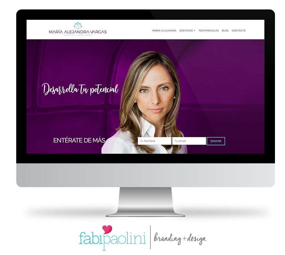
For example, with Maria Alejandra Vargas, she not only has a photo that looks pretty cool, but also the headline “Reach your potential” which attracts the audience she’s looking to connect with.
great photos
Personally, I think that websites that have great photos are incredible for your business. I like to use photos that are capable of attracting more people in the right direction. aka. you. I know that not everyone has access to a photographer, but there are tons of places where you can get incredible photos like iStock Photo or other great photography sites.
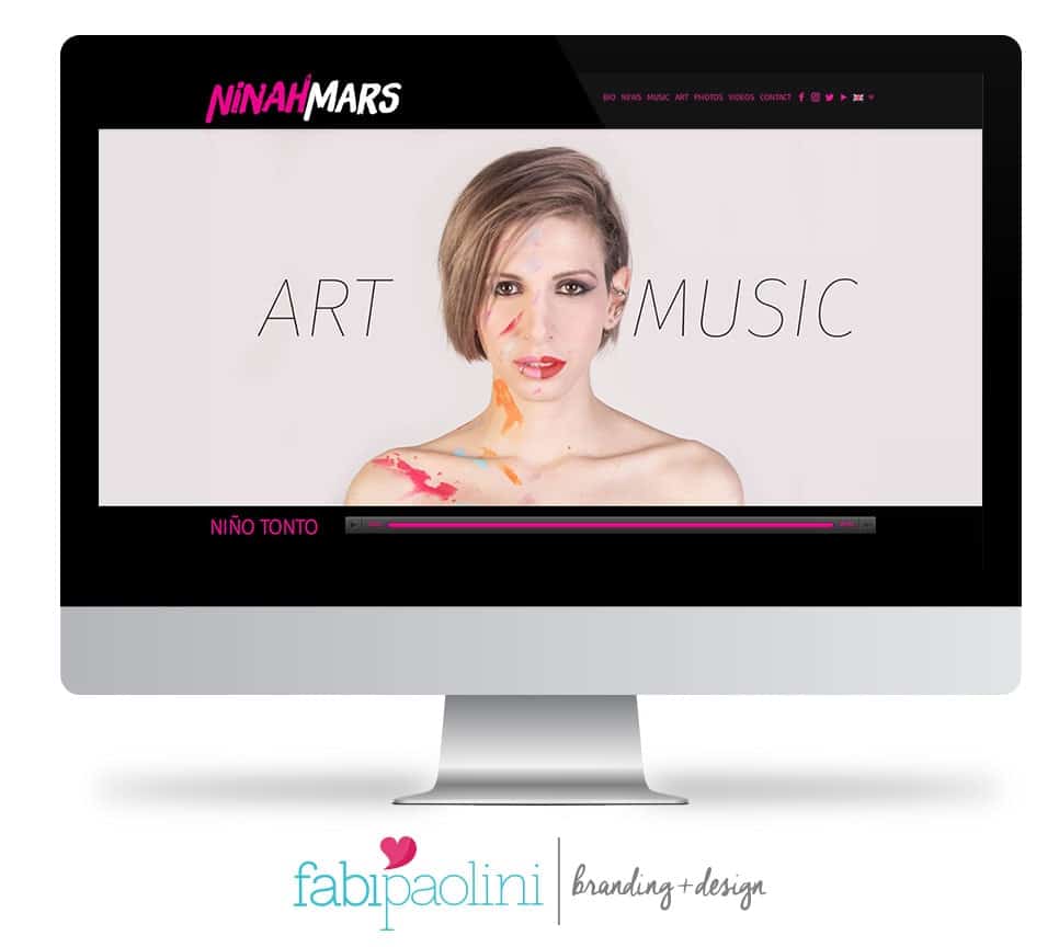
In Ninah’s site, we used photos of her showing the duality between her art and music careers.
content that converts
Of course, it all comes down to content. When you have really great things to share, it all comes together in the best way possible to build your brand. That’s honestly the best way to capture and convert your audience. When you are giving away incredible free value, it makes it easy for people to like you and slowly, but surely, trust you. I always tell my clients that giving away free info, value, articles, guides, etc. on your site are incredibly effective ways to convert people. Of course, that all needs to come together with a sales funnel that’s set up for your audience, right? But, that’s a whoooole different lesson that I will get into soon enough.
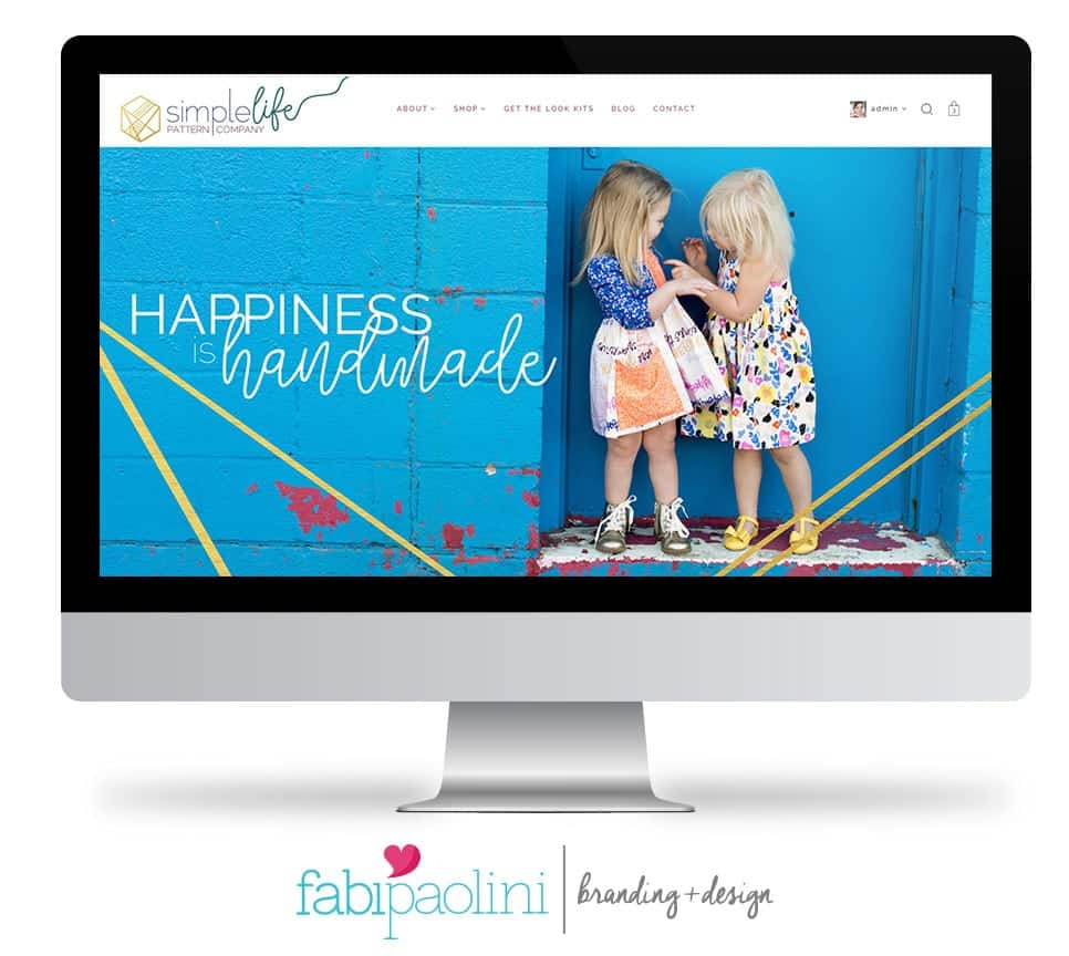
This is one of the coolest sites I have worked on and it is filled with a ton of incredible content. The Simple Life Pattern Company sells sewing patterns so that you can make your own beautiful clothes for girls and babies. This page has all the elements we talked about before. Beautiful branding that we developed, a story that’s well told through color, design and copy, a clear positioning statement, talking about the feeling you get when you use her products “Happiness is handmade, ” simple navigation, good use of above the fold, incredible photos, and, most importantly, unique and awesome content. Not just her paid content, but her free content as well. Her opt-in/lead magnet/freebie (however you want to call it) is of a free pattern you can download. Talk about a great way of showing people that they can make clothes easily with her.
All of these are things I cover in detail in the free branding + website mistakes guide. So make sure to download it right here!
