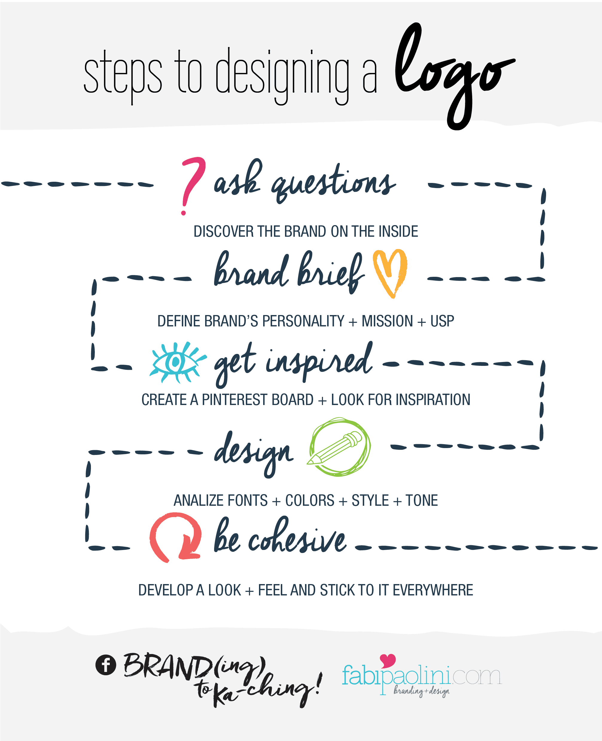
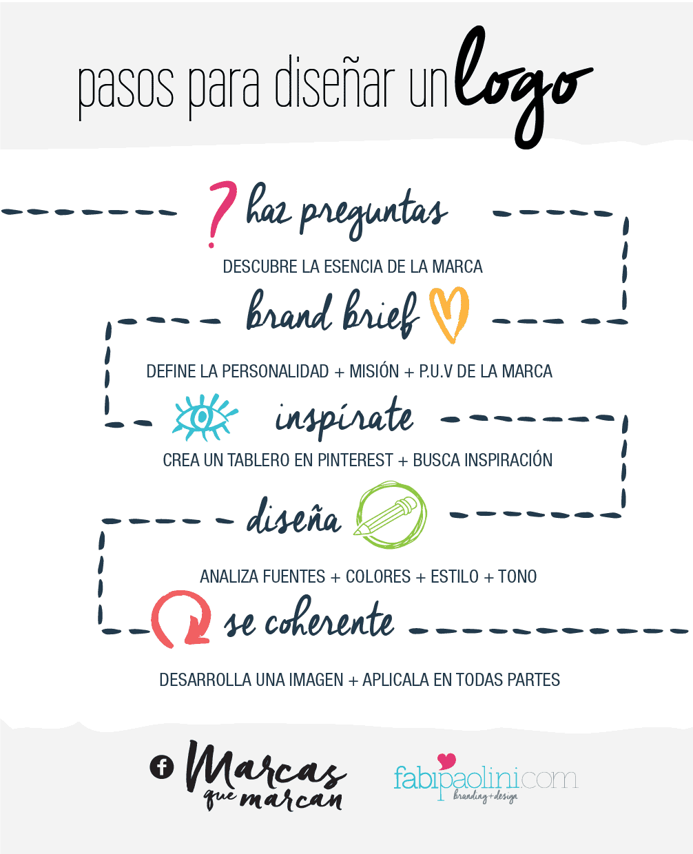
Having a logo is an essential part of every business. Without one, your business simply will not have the credibility it needs to grow. Designing a logo might be a lot more complicated than you think and there are so many parts to it. Here I share the steps I follow to designing a logo.
I was thinking about how much my logo design process has changed over the years. It used to be so simple and basic. I would only ask for the name of the company I was going to be designing for, and then create countless ideas for them. That was it! But, like with everything else, the way I work has really evolved. Over the years I have incorporated different concepts and ideas that make logo design more complex and complete.
You might think it’s very simple to design you own logo, and to an extent that might be true. Just as it’s true that cooking might be easy as well. Now, that doesn’t mean that everyone can do it and have it taste deliciously! So, here are the steps I follow to design logos:
Ask the right questions
It all begins with being able to ask the right questions. You know, the ones that allow you to really know the brand inside out. I have talked about before that branding is a lot more than a logo, and this first step is the one that will help you uncover what’s inside. I usually begin this step talking directly to my client and getting to know who they are.
It’s funny, a lot of time people don’t get how important their own story and personality can be to their business. The truth is, it’s an essential part of what you’re doing. Your story is the driving force behind your brand, and understanding it will help define the personality of your business.
I give my clients a questionnaire in which I ask them to define who they are, what they do, and what makes them unique. Without this first step, I would simply be another designer that creates logos, not one that creates brands.
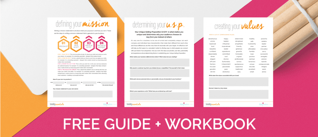
For this, I suggest using my Branding Essentials guide. It’s great in helping you discover the foundations of the brand.
The Brand Brief
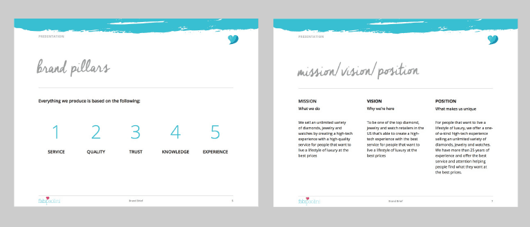
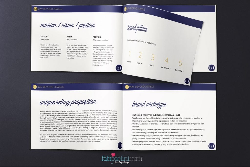
Once the questions are answered, I create their Brand Brief. A Brand Brief is a document containing all the essential information and foundation of the brand. So, in it I help clients write (if they don’t have one already) their mission and vision. We define their Unique Selling Proposition and determine what experience of transformation they’re capable of creating for their audience. Speaking of audience, we define who their target market is, and what the best way to communicate with them is. I also determine what their brand archetype is (personality) and how to use that to their advantage. I talked about all of these things in more detail here.
Basically, a Brand Brief is where the actual brand beyond the logo is actually created. My clients love receiving this since it really gives them an insight towards their business and a guide towards what actions they should be taking for their business.
Getting Inspired
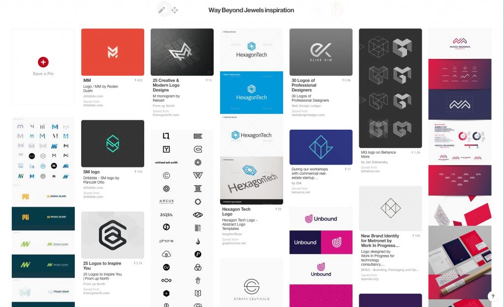
Once the inside of the brand is determined, comes the real fun part. To me, getting inspired is fundamental to the design process. It all starts with looking for inspiration in one of the best places ever: Pinterest. I ask my clients to create a secret Pinterest board in which they pin at least the following:
5 color palettes they love
5 fonts they adore
5 logos they admire
5 textures that interest them
Of course, you can guess that it’s usually a lot more than that! But having this as a base is an excellent idea and way of getting to know the styles that best fit the brand. On my end, I also create a secret board in which I add my own inspiration. This is something that I do taking into consideration all the details that are part of the Brand Brief. So basically, I look to infuse the personality of the brand in those ideas. I also like looking at what their competition is doing in order to know what to do, and what not to do.
Once we have enough ideas and inspiration, I create a moodboard that sets the tone for the type of design that will be more aligned with the brand.
Time to design
By this point, I’m super clear on the brand that I’m working on and what sort of design aesthetics should be followed. So the first thing I do is look at different fonts that follow the personality and the feeling I want to come across. So, if it’s a very serious brand, of course I focus on a classic font. If the brand is more inspirational, I use a script font. Usually I look for fonts in Fonts.com or dafont.com. There are hundreds of resources online!
Once I have defined various fonts, I go to look at color (here’s more on color). I make the decision of what colors to use based on a number of factors. I look at what the industry is used to, I look at the color palettes the client has pinned and I think about the feelings I think the brand embodies. All of these things guide me in determining colors.
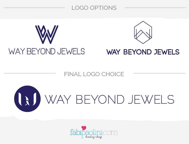
Finally, I design icons in the case that I feel it’s necessary. Here I like to have a lot of fun. Sometimes I begin by drawing ideas by hand and then digitalizing them. Other times, it just simply comes to me. This whole process usually is very intuitive and I believe apart from all the information I gather, there’s a bit of magic in going on that’s guiding me in the right direction. The final logo is always done in Illustrator and in vector format so that it never gets pixelated which would really be bad for your brand image. Here’s more on what makes a good logo great.
Cohesion + variety
Once the client decides on a final logo version and we go back and forth until they are 100% happy and feel that the logo really represents them, we move on to building a look and feel. This to me is one of the most important parts of branding. Making sure your brand looks the same everywhere is what will build recognition over time.
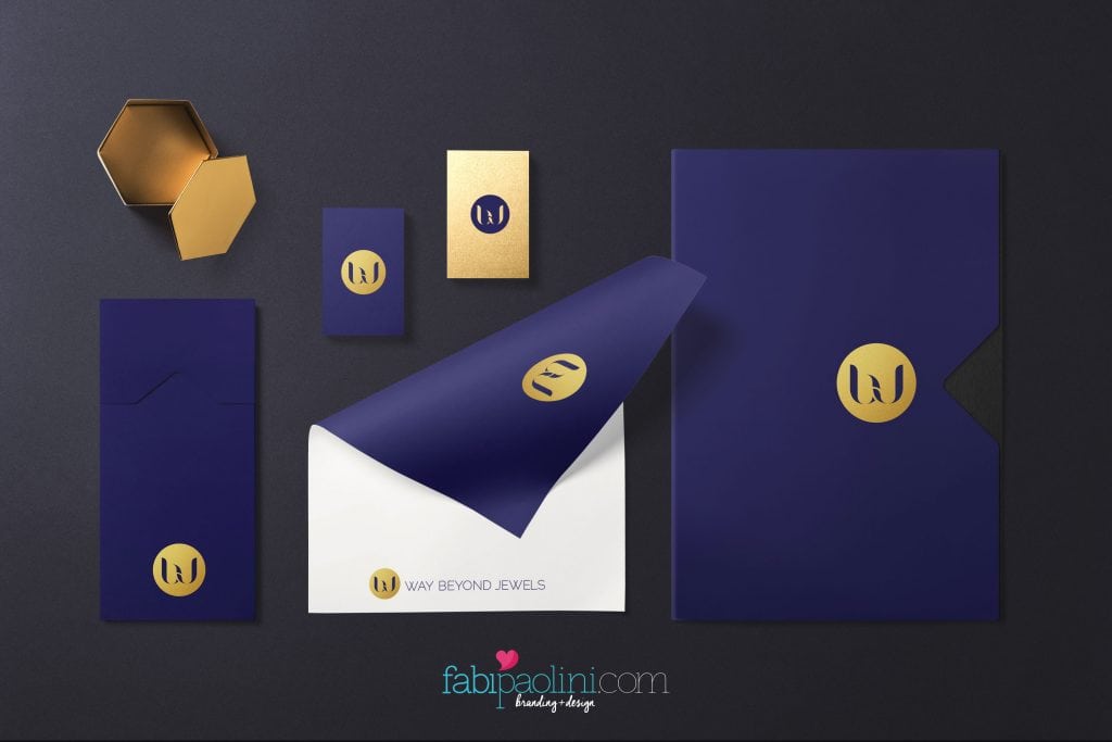
I love creating variations that will help my clients use their logos more effectively. That means that depending on where you use your logo, it will look slightly different, but while still keeping the essence of the brand. This to me is where the success of a brand lies. It’s so important that the image is really cohesive everywhere. Think about all of the touchpoints that you audience has with your brand. So, for example, website, social media, business cards, folders, packaging and brochures. Your image, tone, colors and logo should all be the same in each of these applications.
Delivery
Once everything is defined, I give my clients their logo in all the possible formats that they might need them. So, that means Jpeg, png, Pdf, eps. All of these formats have different uses and applications. I format the Brand Brief to have the logo, look and feel of the brand. This way they can use it everywhere!
As you can see, a designing a logo is not a simple as it may look sometimes. I have been working on this and optimizing my process for over 10 years. I keep on adding more and more ideas and concepts to my process in order for the brand to look as good as possible. In the end, what really matters is that the true nature of the brand is able to come out through the design. So, being clear about who the brand is, what makes them unique and its personality is fundamental to creating a logo that is truly memorable and capable of reflecting who the brand is.
I know sometimes you might be tempted to create a logo yourself, and I get it, it might be a way to cut costs. However, your brand’s logo should never be seen as a cost, but rather an investment. It’s the face of your brand. It’s the opportunity you have to make a lasting first impression. Hiring a professional that has the experience is smarter because they will be capable of truly showing who you are. A great designer will even help you in defining what your brand is all about and what makes you unique. A professional will know what formats are best for your business and will optimize your logo depending on where you will use it. A designer will take your inspiration and ideas and will be able to bring to life what you’re all about.


