Fabi Paolini Branding + Logo Design Logo Evolution Brand

Case Study: Fabi Paolini

As a branding specialist and designer, I make a great deal of effort in making sure that my own brand truly represents what I’m about. So, I want to walk you through my own case study (fun!) so you can see how I define and build my own brand.
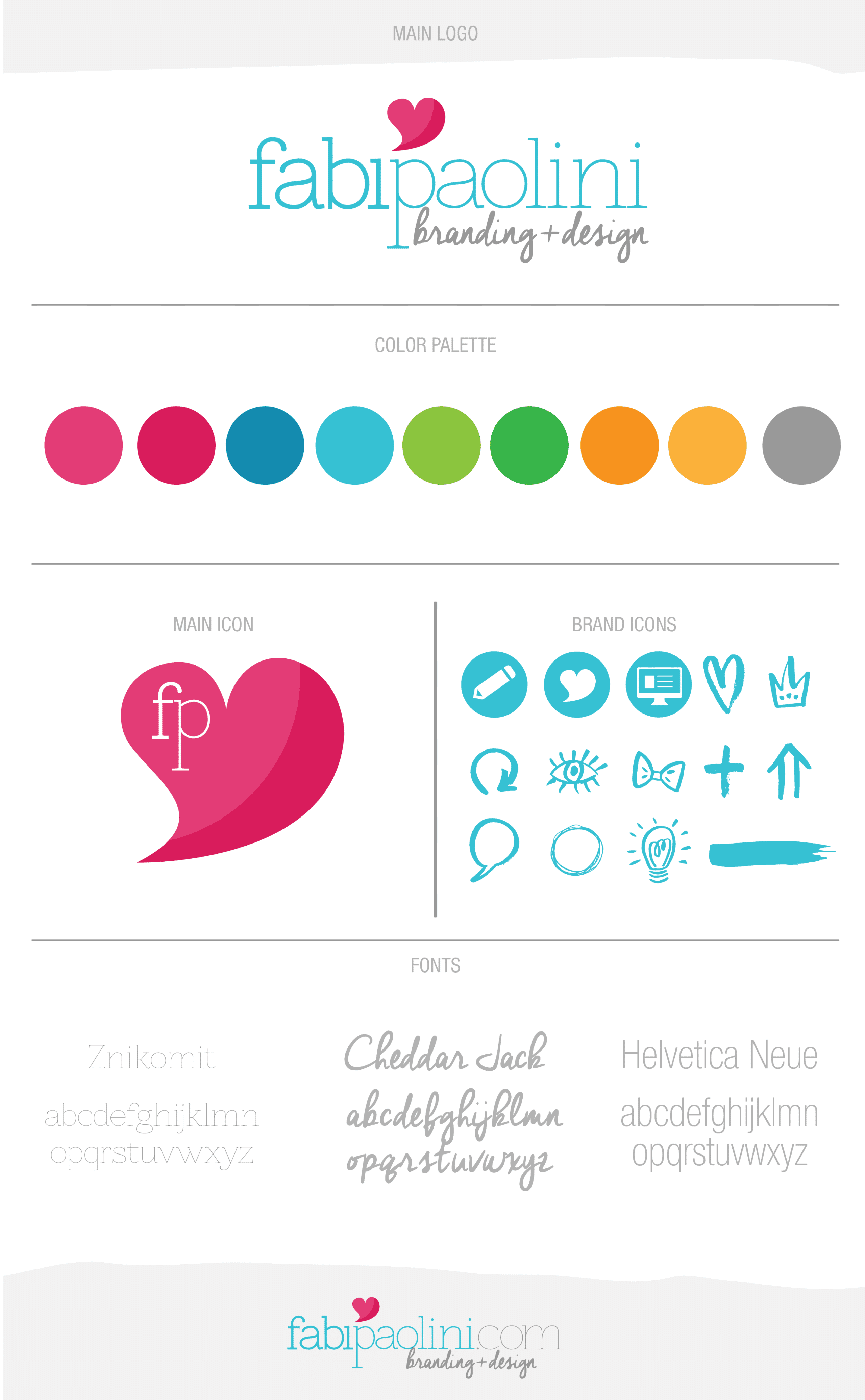
Fabi Paolini Branding + Design Logo Brand Board

My brand is absolutely aligned with what I like and who I am as a person. I love the way color talks about my personality and the heart perfectly says that what I do is help others communicate their essence. But, of course, like with everything, my branding has been a continuous work in progress. I created my first logo when I was just about to graduate from college. I wanted to send out a teaser to all of the companies that I wanted to work with, in order to catch their attention, so I created a logo that was a mesh of an “f” and a “p” for my first and last name. There wasn’t much thinking behind the logo and brand in general, it was just something that I basically drew. Eventually the logo shifted with a better use of fonts and style, but keeping the icon and colors the same.
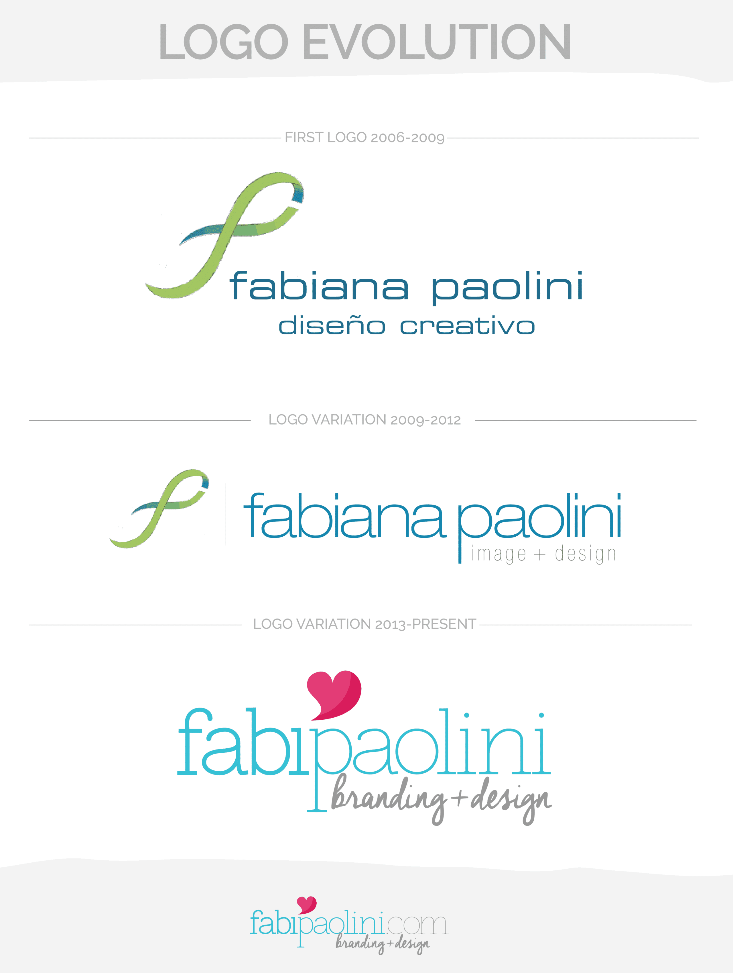
Fabi Paolini Branding + Logo Design Logo Evolution Brand

Web design evolution

The way I did my logo and general look and feel also affected my web design. When I began designing and my career in graphic design, web design was quite different from right now. That’s why it’s crucial to always stay in the right lane, making sure that what you do makes sense with the trends. When I began, websites were all about Flash, something that is completely obsolete today. Since then, I have been learning a lot more about coding and what works best in a website. Of course, in the end it’s all about trial and error, and figuring out what helps you convert most.
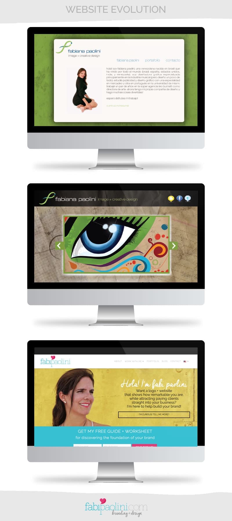
Fabi Paolini Branding + Logo + Web Design. Website evolution

Branding on the inside and out

Okay, so now that you see the evolution of the design on the outside, it’s important for you to know that the main change happened on the inside. I began my career as a designer focusing on talking about the products and services I offered. Seems obvious, right? Well, as the years have gone by, adding hundreds of clients, an MBA and having to jump-start my career in another country has actually taught me a lot. Part of what I have learned has been the importance of focusing on the value I create for others. So, rather than focusing on the service I provide, I’m now more focused on the experience of transformation I can achieve for others. What does that mean? Well, I focus on the problem I am solving and how my potential clients’ lives will be better once they work with me.

Another thing that changed? Defining clearly what my mission was. You see, I used to not really care about what my mission was or see the importance on being clear on it. But my experience has taught me that having clarity on my purpose completely changes the way that I do business. Understanding who I am, what makes me different and the values that I support, are the things that make me: me. It’s what truly drives my brand.

For example my mission is:

I’m a branding specialist + designer that helps entrepreneurs create brands by showcasing what makes them remarkable while attracting more customers + building a successful business.

Really knowing and understanding the inside of my brand help me differentiating who I am all about (here you can read more on Branding beyond the logo). All of this enabled me to redesign the outside of my brand. That means new colors, new language, a new way of communicating, new fonts and styles. The font I used for my logo looks like a typewriter, for example. The reason for that is that I love writing (can you tell?) and I wanted to share this idea through design. The heart? It’s all about communicating the inside of a brand. It’s also about the values that I believe in most. I believe in the good in people, I believe in following your heart. All of these things are reflected in my brand.


So, what does your brand say about you? What do you think about the evolution of my brand? What do you feel my new image reflects? Share your comments below!


KEEP ON READING
  • How my income increased by 1000% in 6 months. Checklist to boost your own business inside. Business + marketing strategies. Branding + design Fabi Paolini
  • How to Brand Your Business. Branding + business tips and advice. Free guide inside to build your brand's foundation, brand identity, brand experience. Click to download
  • 5 mindset strategies that radically transformed my business. Click to read more!
  • Understanding Branding beyond the logo and visuals writing a mission statement, values | branding + design Fabi Paolini

Case Study: Fabi Paolini

Como especialista en branding y diseño, me aseguro en hacer un gran esfuerzo en que mi marca represente verdaderamente lo que soy. Así que hoy quiero hablar sobre mi propio caso de estudio (¡cool!) y así podrán ver como definí y construí mi propia marca.

Fabi Paolini Branding + Design Logo Brand Board

Mi marca esta absolutamente alineada con lo que me gusta y con la persona que soy. Me encanta la manera en que los colores que escogí hablan de mi personalidad y el corazón dice perfectamente que lo que hago es ayudar a otros a comunicar su esencia. Pero, por supuesto, como en todo, mi marca ha sido un trabajo continuo en proceso. Creé mi primer logo cuando me faltaba poco para graduarme de la universidad. Quería enviar un resumen a todas las compañías con las que quería trabajar, con el fin de captar su atención, entonces creé un logo que era una mezcla de una “f” y una “p” por mi primer nombre y mi primer apellido. No había mucho pensamiento detrás del logo y la marca en general, fue algo que básicamente dibujé. Con el tiempo el logo cambió para dar un mejor uso de la tipografía y estilo, pero manteniendo el ícono y los colores.

Fabi Paolini Branding + Logo Design Logo Evolution Brand

Evolución de la página web

La manera en que hice mi logo y mi imagen en general también afectó el diseño de mi página web. Cuando empecé a diseñar y mi carrera en diseño gráfico, el diseño web era muy diferente a como es hoy en día. Por eso es sumamente importante estar siempre en la línea correcta, asegurándote que lo que hagas tiene sentido con las tendencias. Cuando comencé, las páginas se hacían con flash, algo que es totalmente obsoleto hoy día. Desde entonces, he estado aprendiendo mucho más acerca de códigos y lo que mejor funciona en la web. Por supuesto, al final todo es ensayo y error, y entender que te ayuda a convertir mejor.

Fabi Paolini Branding + Logo + Web Design. Website evolution

Branding de adentro hacia afuera

Okay, ahora que viste la evolución del diseño desde afuera, es importante para ti saber que el cambio real pasó desde adentro. Empecé mi carrera como diseñadora enfocándome en hablar sobre los productos y servicios que ofrecía. Parece obvio, verdad? Bueno, con el pasar de los años, después de cientos de clientes, un MBA y el hecho de tener que re-empezar mi carrera en otro país, he aprendido mucho. Parte de lo que he aprendido ha sido enfocado en el valor que creo para otros. Entonces, en vez de enfocarme en el servicio que presto, estoy ahora más enfocada en la experiencia de transformación que puedo lograr en otros. ¿Que significa? Bueno, me enfoco en el problema que estoy resolviendo y en como mis clientes potenciales serán mejores al momento en que empiezan a trabajar conmigo.

¿Otra cosa que cambió? Definir claramente lo que era mi misión. Solía no preocuparme por lo que era mi misión o la importancia de estar clara sobre esto. Pero mi experiencia me ha enseñado que tener claridad en mi propósito completamente cambia la manera en que hago mi negocio. Entender quien soy, lo que me hace diferente y los valores que presto y apoyo, son las cosas que me hacen ser quien soy. Es lo que realmente maneja a mi marca.

Por ejemplo, mi misión es:

Soy una especialista en branding y diseño que ayuda a emprendedores a crear marcas que demuestren lo que las hace resaltar, atrayendo mas clientes + crear un negocio exitoso.

Entendiendo realmente y sabiendo lo que hay adentro de mi marca me ayuda a diferenciar quien soy y lo que represento. (Aquí puedes leer más sobre esto) Todo esto me permitió rediseñar mi marca por afuera. Eso trajo nuevos colores, nuevo lenguaje, nuevas maneras de comunicación, nuevas fuentes y estilos. La fuente que use para mi logo parece de maquina de escribir, por ejemplo. La razón de eso es que me encanta escribir (¿tu crees?) y quería compartir ese gusto a través del diseño. ¿El corazón? es sobre expresar lo que esta adentro de una marca, la esencia. Es acerca de los valores en los que mas creo. Creo en lo bueno de las personas y en seguir tu corazón. Estas cosas están reflejadas en mi marca.


Entonces, ¿qué dice tu marca sobre ti? ¿Qué te parece la evolución de mi marca? ¿Qué sientes que refleja mi nueva imagen? Comparte tus comentarios abajo!