As a designer, I’m always concerned of making sure that the logos I design are really the best possible for my clients. I have been working for over ten years doing the best that I can to make logos that my clients truly identify with.
I always feel that it comes down to a mix of theory, intuition and taste. I have studied branding thoroughly for years. I read about it all the time in order to get more information that will enrich my followers and help build my client’s business. And then, there’s this sense of what my intuition does. I’m absolutely sure that my creative process helps me in building this idea of what the personality of the brand I’m working on is. That in turn becomes a feeling and once I sit on the computer I simply let my hands move on their own. Sort of like a painter with a white canvas in front of them. I always make an effort and make sure I read carefully what the Brand Brief I have created for them says about who they are.
Defining what makes a good logo great is quite subjective. It comes down to how clients feel about their logo and then in turn how their audience perceive it. In the end, you can’t truly control that, but you make and effort to get a reaction and a certain feeling from them. Sometimes you simply look at a logo and know if it’s good or not. However, over the years I feel that there are certain motifs that keep on repeating themselves once and again and again when talking about a good logo. Here are the 5 top things.
Also, I created this free guide which covers all the most common branding + website mistakes you need to make sure you are avoiding.

It reflects your essence
For me this is the key factor to determining what makes a good logo. It’s all about being able to reflect the personality of the brand to its core. Keep in mind though, it doesn’t have to be literal in its concept. So if you sell computers, your logo doesn’t have to have a computer in it. 
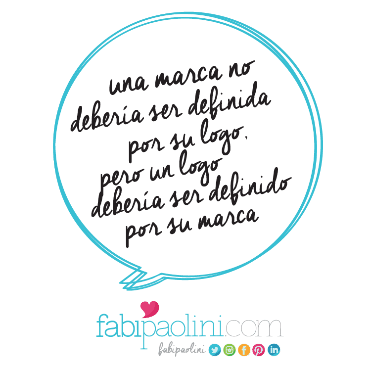
However, what is important is for a logo to be capable of reflecting who your brand is and in someways what it’s about. What do you want people to feel when they look at your logo? How do you want your brand to be perceived? It seems like a lot of weight to be putting on such a “simple” thing, right? But your logo is your first impression, and it’s what will keep on coming up again and again and again for your audience. They will see it in your website, business cards, social media, invoices, packaging and anywhere else you use it. In the end, a brand shouldn’t be defined by its logo, but the logo be defined by its brand.
Sometimes, a logo reflects exactly what you do. I worked with a client a few years ago that is a music producer. I was able to make the connection instantly on what his logo was going to be. Using his initials “DB” I created a musical note for him that clearly reflects what he does and who he is.


Appropriate
It’s important to make sure that the logo is designed taking into consideration what the company does and its target audience. The design must be appropriate for the audience you’re targeting. Last week I talked about the core dimensions of personality and how that affects color psychology. Now, don’t get me wrong. I’m not saying that you should be predictable and boring and not experiment with color, shapes or typography. What I am saying is that if you completely ignore your audience and industry, it could potentially make it harder to make a connection with them. So, for example, if you were selling a product for a Harley Davidson user, having a pink and cute logo might be a bit harder to sell. It’s not impossible, but it’s not truly appropriate for that target audience. I mean look, there are things that simply are more suitable for an industry than others.
This is something I face every single day. Every time I design a logo for a client I really like looking at what the competition is doing. Kind of getting a feel for what is appropriate for the field. Again, it’s not about not taking risks, it’s about having common sense. A few years ago, I designed this logo for a plastic surgeon in Venezuela. It’s appropriate for his industry, but still capable of standing out.
Adaptable
In today’s world, it seems that there are almost unlimited ways in which a design must adapt depending on the media it will be used for. An effective design has to work in a variety of applications. This is something that comes up a lot of the time when I design websites, I see how important it is to have a logo capable of adapting to different sizes and directions in order for them to be more effective. I always like to give my clients a few variations of how they can use their logo, that way they have control of how their brand looks. In essence it’s the same logo design, it’s just that it will vary in form to make sure that it stands out no matter where it is. Adaptability feels essential in our digital world. With so many options, you need to make sure that your logo isn’t lost. Think about it: webpages, social media, iPhone, Android, landscape, portrait, business cards…so many different places, so many directions. If your logo doesn’t adapt, will it be seen?
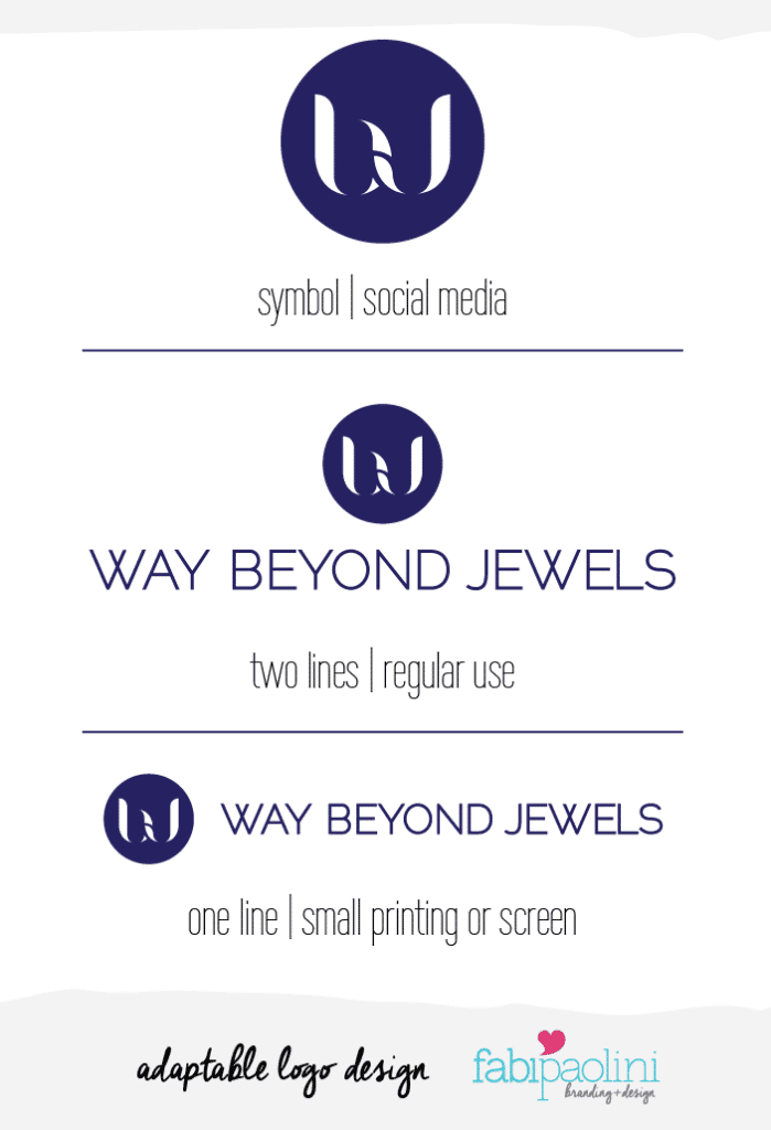
I just finished working on this really amazing project. For it, I created 3 different variations depending on where the logo is to be placed. The actual logo is in 2 lines. When they need to print it small, it’s in one line, and, for social media or icons, it’s just the circle. Make sense?
Simple
In my years as a designer, I have found that when a logo is simple, it tends to be more memorable and effective. This helps in making a logo iconic and something that people are capable of recalling which in turn allows for easy recognition. Having a complicated design will make it hard to duplicate or use in different media. It’s important to not overuse different fonts (keep it at 2 at the most) and making sure you’re telling a story with color. Using too many color should only be the case if it’s truly serving your brand’s personality and you’re using color to get a message across. Now, this obviously depends on what you want to come across and how you want people to feel when they look at your logo. Also, this is about personal style. My style has always leaned towards simplicity. It’s simply what I like to do and how I am known as a designer. I don’t feel comfortable doing logos that are too busy. However, regardless of what my personal style is, the biggest and most famous brands in the world have simple designs. That isn’t a coincidence.
Here’s an example of a logo I created for a Mommy and lifestyle blog. Simple and straight to the point. 
Unique
Finally, a great logo is one that is capable of standing out from its competition. You don’t want your logo to be confused with anyone else. We live in a world where we’re exposed to thousands of messages of all kinds all day, so you want to make sure that your brand image stays with your target audience and is memorable enough for people to make a connection with your business. This is probably one of the hardest things to do. Making a logo that looks and feels unique is not as easy as it may sound, specially when you still have to consider that it should be simple, appropriate and capable of reflecting what your brand is about. I guess what’s essential here is that it grabs the attention of your audience and it’s interesting to look at.
Here’s an example of a logo that is unique and catches your attention. Can you guess what sort of business it’s in? 🙂

As with anything else, this guideline comes from my own experience and thoughts. In the end, what makes a good logo great is something that comes from a feeling that might be hard to define. It’s intuition, style, and the capacity to connect the brand with its audience. Anyways, let’s recap the 5 guidelines I just went through:
- IT REFLECTS YOUR ESSENCE
- APPROPRIATE
- ADAPTABLE
- SIMPLE
- UNIQUE
Or, if you’ve visual like me, here it is in a simple infographic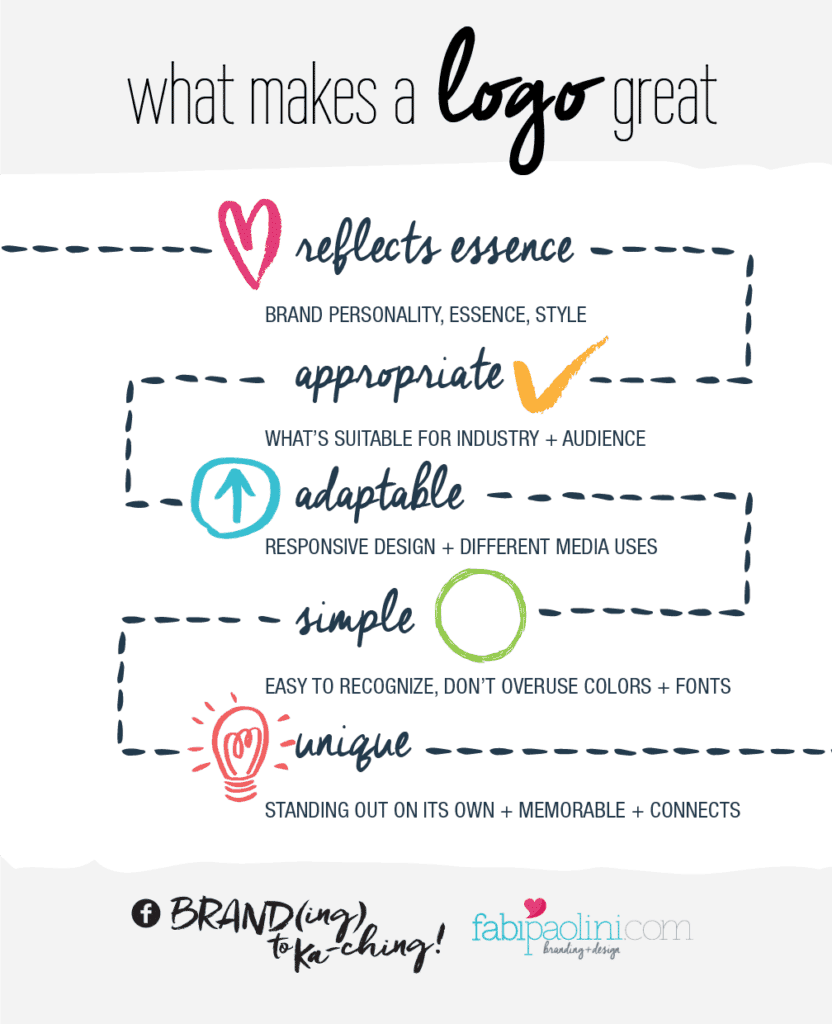
Make sure you download the guide with the most common branding and website mistakes right here:
